The research pointed clearly toward a premium aesthetic. What it also revealed was that every brand we admired had quietly decided ecommerce wasn’t for them. We decided to prove them wrong.


25+
Fabric colorways per product
Millions+
of possible configurations
0
Competitors selling direct
Setting the Aesthetic Direction
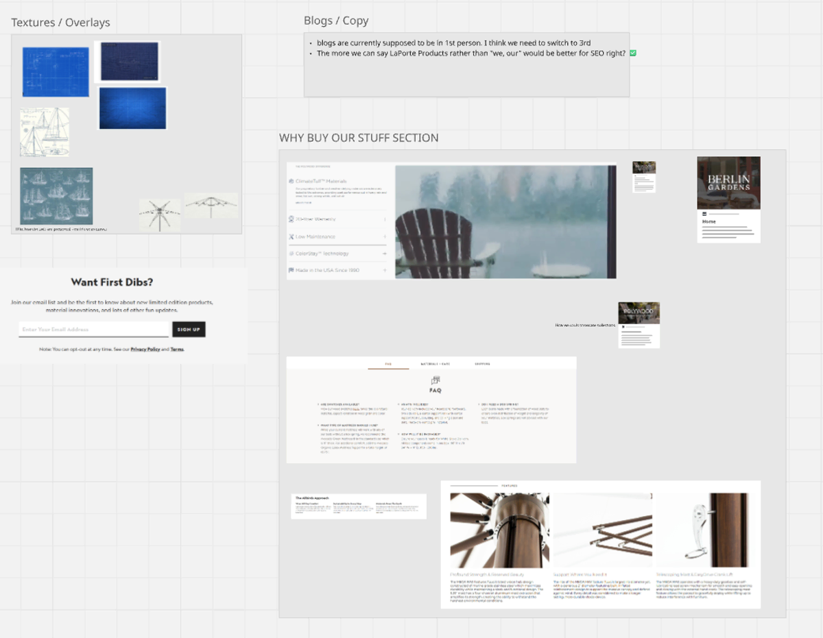
Before a single wireframe was drawn, we spent time immersed in the world LaPorte Furnishings wanted to occupy. High-end European outdoor furniture brands — Berlin Garden, Tucci, and others in the space — share a visual philosophy: restraint, quality, and the confidence to let the product speak. No noise. No aggressive calls-to-action. Just space and craftsmanship.
Our mood boards pulled from that world. Editorial photography. Serif-led typography with generous whitespace. Neutral palettes anchored by material textures. The kind of digital presence that feels less like a store and more like a showroom.


But the deeper we went into competitive research, the more a tension emerged — one that would shape every design decision that followed.
The Problem With the Premium Playbook
High-end furniture brands, almost universally, don’t sell direct. The model is consistent across the space: find a dealer, request a quote, visit a showroom. Ecommerce is treated as incompatible with the premium experience — too transactional, too exposed, too far from the curated environment these brands work so hard to create.
“The brands we admired had made a quiet choice: protect the premium feel by keeping customers at arm’s length. We weren’t sure that trade-off was necessary.”
The question wasn’t whether we could replicate that aesthetic — we clearly could. The question was whether we had to replicate that model. LaPorte had a real opportunity to own direct-to-consumer in a space that had collectively stepped back from it. If we could thread the needle — keeping the elevated, minimal brand experience intact while giving customers a clear and confident path to purchase — we’d have a meaningful competitive differentiator.
We committed to WooCommerce as the ecommerce backbone, with a frontend built to feel nothing like a traditional WooCommerce store. The aesthetic would lead. The transaction would follow naturally.
Homepage – Finding the Right First Impression
The homepage became the proving ground for that bet. It needed to do two things simultaneously: signal premium quality immediately, and make the path to product feel effortless. Early wireframes leaned hard into the editorial direction — sparse, atmospheric, photography-led.
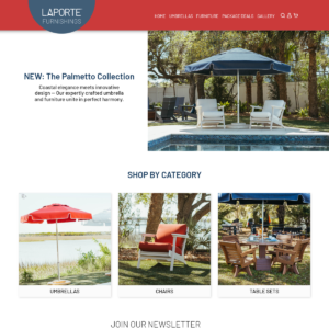
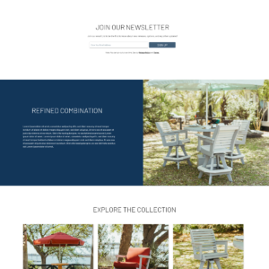
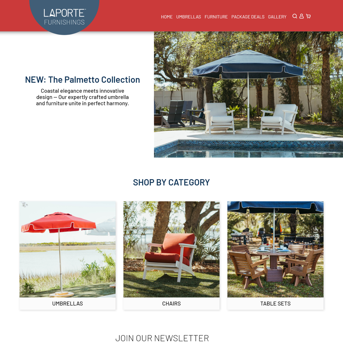
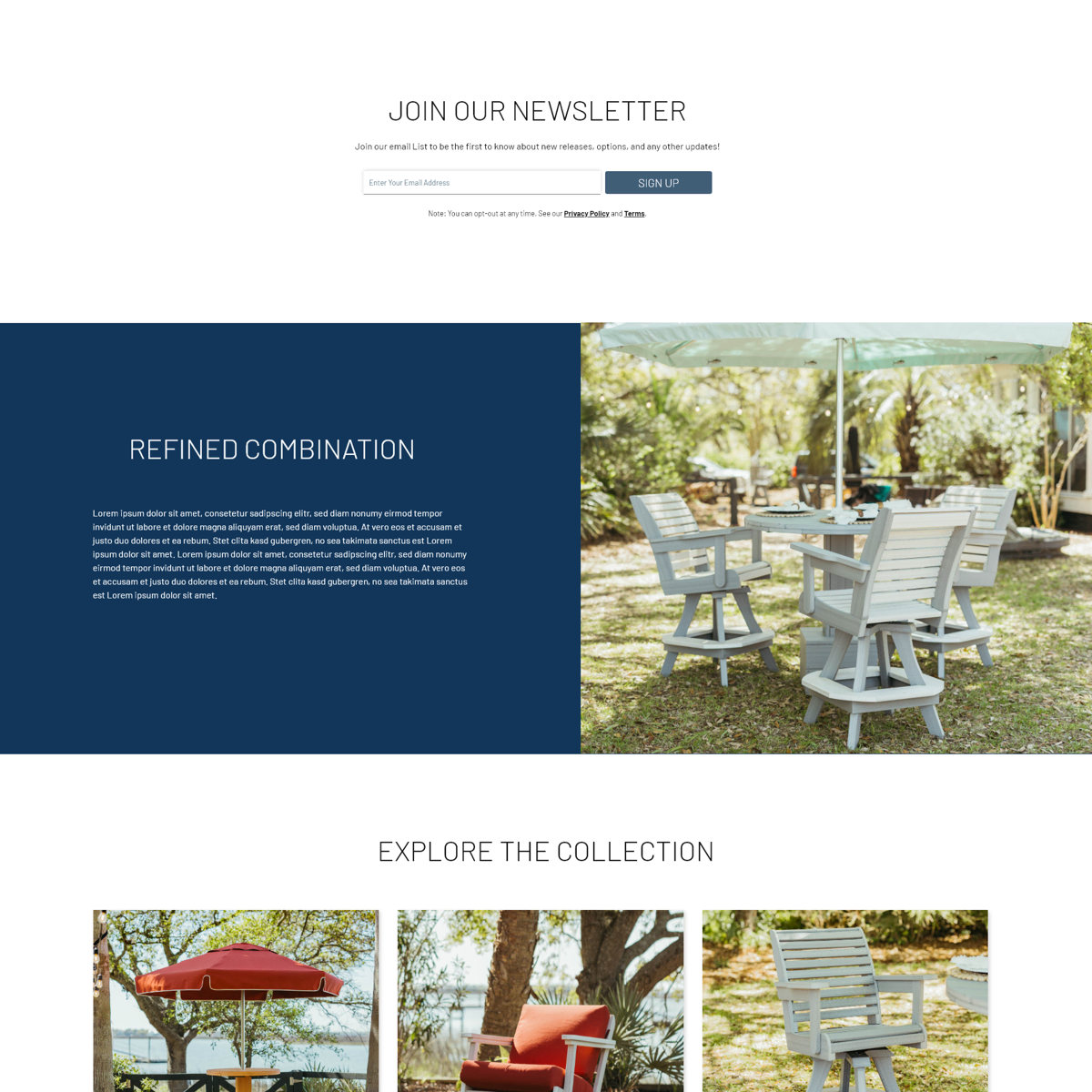
The first direction felt visually right but commercially passive — a beautiful dead end. The second pushed the product higher and gave customers an immediate sense of scope without overwhelming them. Iterations from there were about refinement: how much photography, how soon to introduce navigation, where the brand voice lived in the hierarchy.

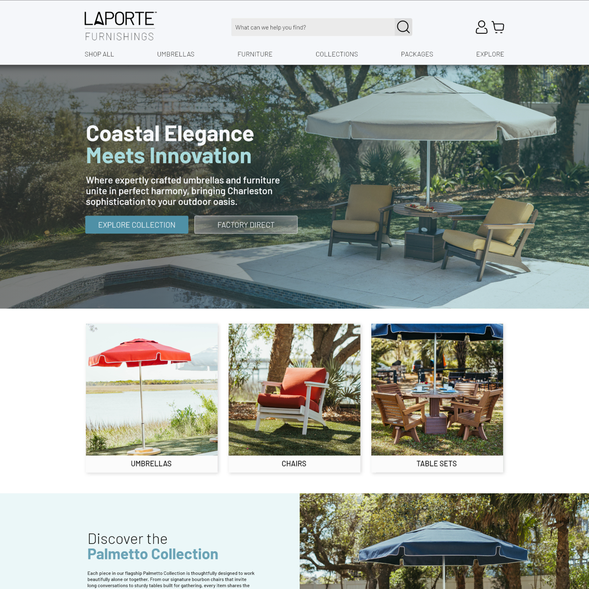
The Complexity Problem — Millions of Options, One Clean Experience
If the homepage was the hardest brand problem, the product pages were the hardest UX problem — and the most technically demanding challenge of the entire project.
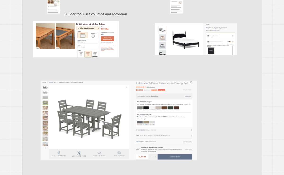
Unlike the Marine side of the business, where configurations are semi-custom and relatively contained, Furnishings products can involve 25+ fabric colorways, multiple table configurations, chairs, umbrellas, and accessories. Across the full catalog, possible combinations run well into the millions. Showing that without overwhelming the customer — or misrepresenting pricing — required a system, not just a layout.
“The challenge wasn’t showing the options. It was making the options feel like freedom, not a form.”
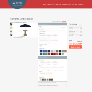

The frontend solution was Studio Wombat’s Advanced Product Fields, configured to guide customers through selections progressively — each choice narrowing the next in a way that felt intuitive rather than procedural. The backend required equally careful thinking: a disciplined category and collection architecture that could scale as new products were added, paired with a live sync to QuickBooks to keep pricing accurate across every configuration state.

The result is a system that handles genuine product complexity without surfacing that complexity to the customer. From a user’s perspective, they’re simply choosing what they love. The architecture behind it is doing the heavy lifting invisibly.
The Decision That Changed Everything
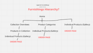
Designing for Furnishings in parallel with an awareness of the Marine brand made something obvious that hadn’t been clearly articulated before: these are not the same customer. They search differently, shop differently, and respond to entirely different brand signals. Forcing them under a single LaPorte website wasn’t just a UX compromise — it was an SEO liability and a positioning problem.
We brought the recommendation to ownership: split the brand. Give each division its own home, its own voice, and its own optimized experience. A LaPorte Products landing site would eventually tie it together — the Honda model we’d been building toward since the proposal. The design process had just made the case undeniable.
The Brand System — Building for What Comes Next
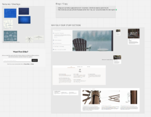
Running parallel to the UX work, a dedicated member of the marketing team took the lead on visual execution — developing a full Brand Style Guide for LaPorte Furnishings that would govern every touchpoint going forward. Typography, color system, photography guidelines, component usage. Not just a document for this project, but a foundation for the next ones.
Weekly syncs between marketing and myself kept the creative and technical tracks aligned — ensuring the elegance of the brand system and the constraints of the WooCommerce build never worked against each other.
With the visual language codified and the UX architecture validated, everything was in place. It was time to build.
I will complete this case study in Part 3: From Blueprint to Browser